
The best vacations always have an element of the spontaneous. For Ashley and Dino Petrone of Instagram’s @arrowsandbow that meant finding their next project while on vacation on Anna Maria Island, Florida. Already well-loved for their RV renovations, the Petrones couldn’t help but shift their focus to a motel remodel when they found a rundown four-unit motel just begging for their brand of TLC.
Before they headed back home to California, Ashley and Dino had their offer accepted on the little inn and started planning to move their family to Florida. Eight months later, Joie Inn was complete.
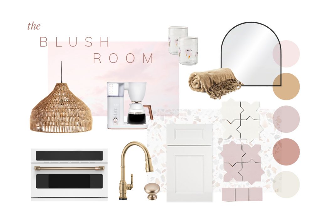
Defined by Color
One of the defining moments in the design of Joie Inn was choosing the color palette. It really set the tone for the entire design. Ashley wanted to remain true to the beachy colors splashed all over the island’s buildings, but also wanted it to feel fresh and immediately comfortable.
Instead of sticking with the vibrant and bold colors that make up the beach community, she looked to the natural surroundings for inspiration. Sunsets, foamy waters, sea oats , and sun soaked afternoons dictated the color palette.
On trend with warmer, cozier color palettes popular in the post-pandemic world, Ashley chose blush as a feature color in one of the suites. In fact, she named the suite The Blush Room.
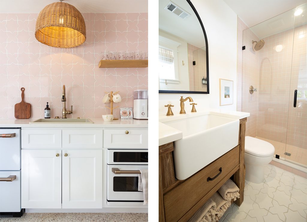
The Blush Room
The coziest room of the inn, the Blush Room is 400 square feet of bliss where you can see the sunset each night—the inspiration for this room’s theme. It has one king bed and sleeps two. The full bath and kitchen has everything you need in a warm, snug space you won’t ever want to leave.
You’ll find the color blush everywhere from the bedding and the shower to the kitchen backsplash and decor. Not only can you see the sunsets, but you’ll feel like you’re enveloped in one.
Why Blush?
This less dramatic pink is a warmed rose that can range from barely there to a light rose hue that is surprisingly versatile. It hit the fashion world first then trickled down to interior design. In 2018, it was hailed as a trend that would stick around.
What makes blush a color that’s easily accepted in interior design and will enjoy a long life? For starters, it’s a neutral. The lighter versions of blush make the perfect backdrop for just about any color scheme. Use it for the walls instead of white for a neutral with a hint of warmth.
Secondly, blush is warm. Warmer colors are all the rage in interior design. The pandemic forced us to spend more time at home, where we craved comforting things about us and color played a huge part in that. In very little time, cool grays and blues that had been so popular shifted to warmer grays and softened blues. Reds, oranges, yellows, and pinks with their cheery demeanor became the colors of choice.
Lastly, blush makes a great statement color. Blush in its bolder forms stands out in patterns, florals, and features. It can easily draw the eye and welcome you into its embrace. Ashley Petrone is a master of this concept. She chose a bold patterned backsplash tile in blush to make the kitchen standout with playful luxury. Blush crops up again and again all over the suite in pillows, bedding, and decor—always making itself known.
Want more of Joie Inn’s colors? Check out the other suites.